Monday, December 31, 2012
Monster Turn Around
Hey guys, so this is the design that I decided upon. Let me know if you guys have any issues with it. I'm planning to move on to color and will probably have a final painting done by the end of this week.
Friday, December 28, 2012
the hub
The first image (1) are ideations for the center piece of the hub. The idea behind it is that this piece would rise from the center, and then the player would have to assemble the mirror to open the final mirror portal. If you prefer some of the silhouette shapes on the bottom please let me know. The second image (2) is the final hub, I added an extra mirror upon request. The third image (3) is the hub with the collapsed floor. The final two images are rough ideas of what the center piece would look like. The first one (4) is broken shards of a giant mirror that would be flying around the whole room, and the character would have to dodge and jump on top of them to reach the white sphere. The second one (5) is a tower shape rising from the floor and on top of it would be the center piece.
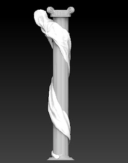
Modeling Progress
Almost done with the column, still need to work on the Folds and some details......
Now I will start building the Character, and will show some progress next week.
Thursday, December 27, 2012
animation update
****it's loud**sorry****
my updated animation, working on his face and lip sync.
let me know what you think.
thanks!
Tuesday, December 25, 2012
Bloody Mary Monster
Hey guys, let me know what you think of these ones. Was trying out some ideas with a horny growth growing out from her face and mainly designs with wings and faces on the body.
Friday, December 21, 2012
Color keyes
Here are some VERY VERY lose color keys over Aaron's boards. If you guys critique them I can make corrections and tighten them enough that I can take out Aaron's lines on Monday.
Reference is at the top.
Reference is at the top.
Mirror World concept
Just an idea of what surrounds the central chapel area, a dilapidated town with deep pits in the roads that are filled with poisonous gas, and descending roots that invade the skyline.
witch painting and early creature ideations
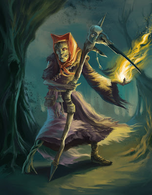
Tried to be a little more specific with the textures with the clothing and fire. Also fixed her pose.
These are really rough ideations. I tried to play around with themes of ash/soot, fire, slender appendages, doll and some root aspects. For the ones with the wings, I thought it would be interesting to have the wings be a cloud of ash/smoke, or doll like appendages wrapped in a burlap material? Kinda like how some of the characters in the animated film, "9" were wrapped in burlap.
Most of them have the monster part of her extending out from the bottom, so her human-like form is attached like a head to the creature.
Let me know what you guys think. I can get more specific with everything once I have some kind of direction. Thanks!
Monday, December 17, 2012
Saturday, December 15, 2012
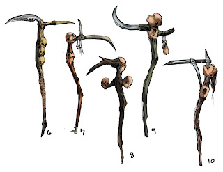
Witch's staff
Just posting these staff/weapon ideations to share. Was playing around with the doll idea and how they can be incorporated into the witch's prop/weapon. The scythe of the grim reaper was used as a tool to "harvest souls", so I played around with the idea that maybe she used it to harvest the souls of the girls.
Tuesday, December 11, 2012
presentation for tomorrow
Hi everyone,
I wasn't able to make the last meeting and just wanted to be caught up. I have done my blocking for my shot and will have it up on the server later tonight (after work). I can help present the animation end in the morning if you would like.
Hope everything is going great,
Nick
I wasn't able to make the last meeting and just wanted to be caught up. I have done my blocking for my shot and will have it up on the server later tonight (after work). I can help present the animation end in the morning if you would like.
Hope everything is going great,
Nick
Monday, December 10, 2012
Color Comps
Here's an update on the color comps for Gavril. Let me know what you guys think.
Rackham colors:
Fowkes colors:
Rackham colors:
Fowkes colors:
Mirror World Level 1 comps
Hi guys, here are some scenes I pictured being in this first level. I want to mix World War I imagery with deformed, twisted nature. I'll have more soon...
Sunday, December 9, 2012
Witch Color Comps and Turnaround
I did some color comps for the witch. If there is one that might work, feel free to comment. I also started doing the turnaround too....but it can always be changed.
I can probably start doing a full painting of the witch for wednesday if I have an idea on the color
I can probably start doing a full painting of the witch for wednesday if I have an idea on the color
Mask Shapes
Hey guys, was wondering if I can get your opinion on the appearance of the witch's porcelain mask? I wasn't sure if the mask should appear more like a small child (rounded/baby features) or a young adult (more mature features, but still feminine). I guess the rounded features of a baby mask would contrast a lot with the character's sunken posture and bony features.
Saturday, December 8, 2012
CLARIFICATION!
We are doing our project as though Nathan Fowkes painted(COLOR AND CREATING FORM) it with the textures and natural elements of Arthur Rackham(ASYMMETRY AND TWISTED FORMS).
Friday, December 7, 2012
Thursday, December 6, 2012
Bloody Mary Mirror
Hey everyone, this is the mirror that I am working on.........
Zbrush Crash.......I have start again..... This is what I have for tomorrow.
Any critique will be great~
Subscribe to:
Comments (Atom)


